Read price action, understand participation, and plan around meaningful levels.
Find Your Levels
A practical guide to reading price action, understanding participation, and planning around meaningful levels.
Finding your levels starts with understanding why certain prices deserve your attention. A prior high, a consolidation area, or a level reclaimed after a selloff can give you a reference for the next move. What matters is how price behaves when it gets there, how much participation accompanies the response, and what happens next.
Start with the reasons traders buy and sell, then learn to read price and volume, follow the trend, and map the levels that matter. Indicators add context, setups define the response to wait for, and the final chapter brings those pieces into a trade plan. Using active momentum stocks, the guide connects daily context with intraday decisions. The goal is to explain your level map, recognize what strengthens or weakens the read, and know when the response offers a trade or a reason to wait.
A chart is a record of transactions made by people and systems with different positions, plans, and pressures. One trader sees a chance to take profit. Another wants to get out near break-even. Someone else sees the beginning of a new move. This chapter helps you understand why traders may act differently around the same price, and how their responses help explain why levels matter.
A previous high can bring those decisions together. A break changes the situation for buyers, holders, and short sellers. Start with a simple question: what is price doing here, and how could that change who acts next?
Price doesn't move in a straight line. It pushes up, pulls back, pauses, and pushes again. Trading that rhythm is like jumping into a turning rope: you don't leap at a random moment. You watch the rope come around until the timing is clear, then step in. Each push and pullback also changes the situation for the people trading it.
Imagine a stock running on morning news. It reaches $6.00, then pulls back to $5.20. One trader bought near $6.00, expecting another leg up; buying with that expectation is going long. Another bought earlier, below $5.20. One is now watching a loss; the other is watching part of a profit disappear.
A third trader sees a bounce fail on the way down and takes a short position, expecting lower prices. A short seller profits by buying the shares back for less than they sold them for; that buyback is called covering. So buying can end a bearish trade as well as start a bullish one.
While price sits near $5.20, the trader who bought at $6.00 starts bargaining: "If it ever gets back to my entry, I'm out." Then the stock finds its footing and climbs back toward $6.00. That trader sees a chance to get out near break-even, and the earlier buyer sees a chance to take profit. Both consider selling, for different reasons. That potential selling is one explanation for overhead supply: selling interest a recovery meets at higher prices.
Meanwhile, the recovery is moving against the short seller, who may buy back shares to exit. And a trader who missed the morning run sees price challenging $6.00 and considers buying for the first time.
Same price, different decisions. Some traders want out, some want in, and others are waiting. Watch the response at $6.00 to see how it resolves.
The choices in that story fall into four common position changes:
Position Change
Action
A Participant Story at a Level
Opening or Adding to a Long
Buy shares.
A trader buys a breakout or adds after a retest holds, expecting the move to continue.
Closing or Reducing a Short
Buy shares to cover.
A short seller takes profit near support or buys back after a recovery challenges the bearish read.
Closing or Reducing a Long
Sell shares.
A holder takes profit near resistance, exits around break-even, or cuts a loss after support fails.
Opening or Adding to a Short
Sell shares short.
A trader sells a failed rally or a breakdown, expecting lower prices.
These are position changes, so the same trader can appear in different rows over time. Someone buying is not necessarily making a fresh bullish bet; they might be closing a bearish trade. Someone selling might be taking a profit.
Different reasons can produce orders in the same direction. New long buying and short covering can reinforce an advance; long exits and new short selling can reinforce a decline. Covering can also lock in a profit; it does not always mean a short is losing.
As our stock recovers, the trader waiting to buy a dip and the short seller looking to exit may both decide to buy. Their reasons differ, but both bring demand to the market. Demand is willingness to buy a quantity of shares at a particular price. Supply is willingness to sell. Both change as price moves and traders reconsider their plans.
That raises a useful question: if every completed trade has a buyer and a seller, why did our stock move down and then recover? Look at urgency and available liquidity: who is willing to transact now, and how much can be bought or sold at nearby prices. A bid is a price someone offers to pay; an offer is a price someone offers to sell at.
If buying keeps taking offered shares faster than selling interest replenishes, trades can move to higher offers. Sellers accepting lower bids can similarly move price down. Orders can also be withdrawn, leaving less interest in the way. Substantial trading can therefore produce little movement, while lighter trading can sometimes move price farther.
Return to the stock finding its footing near $5.20. The decline stops making progress, price spends time in a small range, and then it rallies. That area gives us somewhere to watch if price returns. Some earlier holders may have exited during the pause, but the visible change is the structure. We will use supply and demand zones to mark some of these interactions in Chapter 4. For now, focus on the change in behavior: selling was moving price down, then it no longer did.
The recovery brings our stock back toward $6.00. The earlier retreat gives us a resistance reference: an area where the advance stalled or turned lower. The pause and recovery near $5.20 give us a support reference: an area where the decline stopped and price recovered. Buyers meeting continued selling is one explanation for that support; selling losing urgency is another.
We know where price responded before. We do not know how many earlier buyers remain or which traders will act on the return. Watch what happens when price reaches the $6.00 ceiling again.
Suppose a new short seller enters just below that ceiling and places a buy stop above it. A move through the stop's trigger activates the exit order. Another short seller may have entered much higher or use a different exit. The same breakout changes their situations differently.
For that short seller, a rising price can make the decision feel more urgent. They might choose to exit, have their stop triggered, or face a broker-required liquidation. Keep those situations distinct: an uncomfortable position alone does not require an immediate exit.
An experienced trader watching this might say, "It gets interesting over $6." That isn't a prediction. It names the price where the situation changes for shorts, holders, and new buyers.
Follow the test at $6.00:
The Rejection: Price tests the area, fails to sustain higher prices, and retreats. Sellers may be absorbing buying by continuing to supply shares as buy orders arrive, limiting upward progress. Buyers losing urgency can also produce a rejection. A later attempt that stalls again strengthens the resistance read.
The Breakout: Price clears the ceiling, and three things can happen close together:
Stops trigger. Shorts with buy stops above the ceiling are bought out automatically; each exit is a purchase.
Scanners light up. The new high puts the ticker on momentum scanners, in front of traders who weren't watching it.
Momentum buyers join. New buyers arrive while shorts are still covering, and existing longs may add. With little overhead supply above the old ceiling, price can move quickly.
Not every short has a stop there; others reconsider as the move eats into profits or deepens losses.
The Return: A pullback that holds above the broken level and begins moving higher supports the read that the old ceiling is acting as a new floor. New longs have somewhere to assess the response, while shorts must reconsider another failed downward attempt. A return below the level followed by a failed recovery weakens that read.
When rising price pressures shorts to cover and that buying helps drive price higher, the feedback can become a short squeeze. A fast green move alone does not identify how much buying came from covering. Even a move fueled by covering can stall when fresh selling meets it.
Back to the turning rope. Now that you have seen who might act at a level and why, here is how this guide trades it.
It's human nature to want in on the green candle. The stock is running, it feels alive, and stepping in feels like joining the winning side. That pull isn't a flaw; experienced traders feel it too. The skill is pausing for one beat to ask two questions:
Am I buying into supply or off support? Is price heading straight into a ceiling where holders may want out, or pulling back to a level that has held?
Is the evidence lined up behind me? Is volume picking up on the push and price keeping its gains, or am I reacting to a single green candle?
When the answers line up, step in with a plan. When they don't, let the rope keep turning and wait for the next pass.
Three principles carry the approach:
We buy support, not breakouts. We would rather buy a pullback to a level we trust, with a stop just beneath it, than chase price into the highs. Support includes a freshly flipped level: a former ceiling that price cleared and then held on the retest. That is why the Break and Retest setup in Chapter 6 enters on the retest, not the first break. The chaser and the support buyer may be watching the same level; one is paying up near the high, the other has a nearby reference for risk.
We let the evidence build conviction. A level alone is a reason to watch. A level that holds, with volume picking up on the next push and price keeping its gains, is a reason to act. We don't buy because price is near support; we buy because the response shows support is holding.
We sell into strength. Mark the next level up before you enter, and plan to take profit as price approaches it, while buyers are eager. Selling to late buyers on the way up is the opposite of selling in a panic at the low.
The stories help us consider who might act next. Candles and volume show the result of the activity, without identifying each trader's position or reason for acting.
A reclaim, for example, happens when price regains a level it had lost. Shorts who entered below it now face an adverse move, so their exits could add buying. The next pullback and push tell us whether the recovery is holding up. If price loses the level again, update the read even if the covering story still sounds convincing.
Chapter 2
Reading Price & Volume
Price and volume describe different parts of the same trading activity. Candles show how far price moved and where it finished; volume shows how many shares traded during the interval. Reading them together helps identify bullish and bearish signals.
In a healthy advance, volume usually increases with the push and quiets on the pullback. When heavy volume produces a stall, or arrives as price gives ground back, the balance is shifting. The question to ask each time is what did the activity accomplish? This chapter starts with that comparison and how heavy trading can turn a price area into a level worth mapping. It then follows volume through the trading day and through the push, pullback, and next attempt, and ends with the bullish and bearish signals that bring it together.
Reading price and volume helps us notice when the character of a move is changing. In a healthy advance, volume usually increases with the push: more shares trade as price climbs, and the candles keep their gains. Pullbacks come on lighter volume. To read any candle or push, compare the activity with the progress it produced:
More activity, more progress: Increased volume accompanies a candle or push that covers more ground and keeps it. Participation is carrying the move.
More activity, little progress: Increased volume produces a small body, a long wick, or a stall. Opposing orders may be absorbing the activity; watch which side gives way on the next attempt.
Less activity, more progress: Price covers ground on lighter volume. Little opposing liquidity may stand in the way, or interest may be fading; the next pullback helps tell those apart.
Less activity, little progress: Quiet trading in a small range. Watch where activity returns and whether it produces progress.
Heavy or light compared with what? Compare completed candles of the same duration, such as the pullback bars against the push bars before them. How Volume Changes Through the Day adds the other baselines: the stock's normal activity and the time of day, since an opening-drive bar and a lunch-hour bar start from different levels of activity. A volume bar's color follows a price rule, such as whether the candle closed above its open; it does not count buyers and sellers separately.
Levels matter because many traders watch the same prices and act on similar habits: taking profit at a prior high, buying a reclaim, getting out near break-even. Volume shows where those decisions were concentrated. When a candle trades unusually heavy volume, many shares changed hands inside its range, and a return to that range can bring those traders' decisions back into play.
The chart does not show who still holds a position, so we work from a reasonable assumption and let the return test it:
Possible trapped longs: When a heavy-volume candle is followed by a selloff, many traders who bought inside it may still be holding at a loss. You'll also hear them called trapped buyers, as in a bull trap, or bag holders. Their next move is to sell: a recovery into that range can meet selling from holders getting out near break-even, adding overhead supply.
Possible trapped shorts: When price rises above a heavy-volume candle, shorts who entered there may be holding losses, as in a bear trap. Their next move is to buy: covering can support a pullback toward the area or add fuel to a push higher.
Not everyone near a level is trapped. Buyers waiting at support or a demand zone want in; they help support hold, rather than adding selling.
The timeframe changes how much weight the assumption carries. On a 1- or 5-minute chart, heavy volume often reflects traders moving in and out quickly, and many of those positions close the same day. On a Daily, Weekly, Monthly, or Yearly chart, heavy volume followed by a selloff is more likely to leave traders still holding. That makes the trapped-trader assumption more reasonable there, and it is why this guide's level map starts on the higher timeframes.
A practical question follows: is price above or below the heavy-volume candle? Above its high, most of that candle's buyers are likely profitable. Below its low, many may be underwater, and a recovery has their potential selling to work through.
The heavy candle shows where to look; the response on a return shows whether the assumption holds. A stall inside the candle's range fits it; a move through the range that holds on the next pullback weakens it. Positions get closed over time, so an area that price has traded through repeatedly can lose its pull. Chapter 4 covers finding these candles across timeframes and drawing the level.
Similar volume can produce very different ranges, the distance from a candle's high to its low. Compare ranges across candles of the same duration to see whether price is covering more or less ground for the activity involved.
Available liquidity helps explain how far orders move price. When buyers seeking immediate execution take the shares offered at one price, continued buying can reach higher offers if sellers do not replenish those shares. When sellers take the available bids, continued selling can reach lower bids if buyers do not replenish them. Orders being withdrawn can also leave less available interest at nearby prices.
With less opposing liquidity, a similar amount of trading can move price farther. More aggressive buying or selling can also expand the range as it consumes available offers or bids faster than they are replenished. Conversely, substantial volume can produce little movement when fresh bids or offers keep absorbing incoming orders. That is why small candles on heavy volume deserve attention: a lot changed hands without much progress. The candle shows the movement; it does not reveal the available liquidity throughout the interval.
Range expansion draws attention; retained progress helps us assess momentum. A larger range can include movement in both directions, so check where the candle closed. Then follow whether subsequent candles extend the move, hold the gained ground, or reverse through it.
Volume follows a daily rhythm, so the same bar can be heavy at lunch and ordinary at the open. In US stocks, activity is typically highest near the open, quieter through midday, and rising again toward the close. Judge each bar against what is normal for that time of day; a catalyst can change the rhythm.
Relative volume makes the same comparison for the whole stock: today's cumulative volume against what the stock normally trades by the same time of day, using consistent lookback and session settings. Scanners usually surface stocks with high relative volume, which is how a stock comes into play after news, earnings, or a sector move. High relative volume tells you where to look; the price and volume response at a level tells you whether a trade is developing.
Premarket (4:00 – 9:30 AM ET): Often thinner liquidity and catalyst-driven spikes. With fewer shares available, a small amount of trading can move price farther. The premarket high and low become session landmarks, and the move into the open frames the potential opening gap.
Opening Drive (9:30 – 10:00 AM ET): Often heavy volume and large high-to-low candle ranges as overnight interest meets regular-hours liquidity. Tall bars are common here, so compare them with the stock's usual opening activity before calling them unusual.
Mid-Morning (10:00 – 11:30 AM ET): Activity often settles while the opening structure develops. Look for whether trend continuations, retests of the high of day (HOD), VWAP reclaims, and curls are holding or repeatedly failing.
Lunch Lull (11:30 AM – 1:30 PM ET): Activity often slows and can stay lighter into the early afternoon. Judge smaller volume bars against that time of day, and step back when price repeatedly crosses levels without progress.
Power Hour (3:00 – 4:00 PM ET): Activity often increases toward the close. Intraday traders closing positions, swing traders positioning for the next session, and closing orders can all contribute. Read the direction and structure of that activity rather than assuming the buying is short covering.
Chapter 4 maps the session landmarks this rhythm creates: the premarket high and low, the opening range, and the high and low of day.
Volume patterns show up across a push, its pullback, and the next attempt. Following that sequence shows whether an advance is preserving ground or repeatedly giving it back. For a bullish continuation, we want higher volume on the push up and lighter volume on the pullback. A quieter pullback that gives back little ground and holds support strengthens that bullish read.
During the push: Does increased activity carry price higher, and do the candles retain their gains? Several tall volume bars with little progress tell a different story from a steady advance.
During the pullback: Does activity quiet down, and how much ground does price give back? A shallow retreat on lighter volume can fit a pause. Heavier volume than the push is a warning, even when the candles are small. A deep retreat still matters even when its volume is low.
On the next attempt: Does price regain ground as participation returns, or does the bounce stall below the earlier high? The response helps you judge whether the advance is continuing or losing strength.
A trader who missed the first push may welcome a pullback, while an earlier buyer may use the next bounce to take profit. Watch the result of that interaction: are pullbacks preserving the advance, or are rallies repeatedly giving it back?
Three patterns come up again and again. The signal tables at the end of the chapter collect them with the other bullish and bearish signals.
This is the bullish version of the sequence above. The pullback is the part that is easy to misread. A string of red candles can look like trouble even when volume is light and price is holding support. Compare the pullback's volume and depth with the push before it.
Selling pressure is the reverse: the pullback carries more volume than the push. It is easy to miss near a high, because the candles can stay small while price is still close to the top.
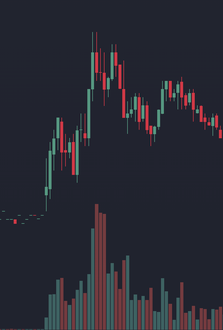
In the FFAI chart below, three consecutive red candles follow the first push to the high. Their bodies are small compared with the green push candles, yet each has a larger volume bar than any green candle on the chart, including the biggest one in the push. More shares changed hands while price slipped than while it climbed, and all that trading produced no upward progress. That is a bearish signal: a reason not to re-enter for another leg higher while price is still near the high.
FFAI 1-minute chart, October 14, 2026.
The warning came before the larger decline; the later selloff and bounces that fail to recover the highs strengthened it. Profitable longs taking gains, late buyers exiting, and new shorts are possible contributors. Recovering the high and holding it would be the reason to reassess.
After a selloff, a curl shows the opposite change. The red volume bars shrink as the decline slows and price starts holding higher lows; then volume increases as price turns up and clears a nearby high. Quiet selling by itself is only quiet trading. The read improves when the returning volume produces upward progress.
Context still matters. In FFAI, price later rounds upward while still below the high and within the damaged advance. The shape improved, but the selling pressure above had not been recovered, so it was not a reason to buy another leg higher. Chapter 6 covers the curl as a setup, with its own trigger and invalidation.
The tables below collect the chapter's comparisons into signals. Each row combines the volume, the progress it produced, and where it happened: through a level, on a pullback, at support or resistance, or at a new high or low. Around a mapped level, follow the next response too: does price hold the ground it gained, recover after a pullback, or fall back through the level? Each bullish signal is paired with its bearish mirror, row by row.
Large Green Body Through a Level + Increased Volume + Close Near Its High
High Activity, Strong Upward Progress: Substantial trading accompanied a break that retained much of its advance. New longs and short covering are possible contributors.
Does trading remain above the level? A pullback that holds adds to the breakout read; a quick return underneath challenges it.
Small Red Pullback Candles + Lower Volume Than the Push
A Quieter Pullback: Completed pullback candles have smaller high-to-low ranges and lower volume than those in the preceding push. Preserving much of the advance or holding a reclaimed level fits a controlled pause.
Watch for renewed price progress with volume picking up. A deeper decline through the level weakens the read, even if volume remains light.
Long Lower Wick at Support + Tall Volume Bar
Heavy Trading, a Recovery from the Low: Price traded down into support, then recovered before the candle closed, leaving a “bottoming wick.” Buyers meeting incoming sell orders, or shorts covering, could explain that recovery. The candle can be red or green.
Does support hold on the next test? A higher low and recovery above the nearby swing high with increasing volume strengthen the bullish read. A move below the wick's low weakens it.
Push to a New Low + Fading Volume + Little Follow-Through
A Quieter New Low: Less trading accompanies the new low. Selling may be losing urgency, or price may be slipping through limited bids.
Does price stop making lower lows and build a higher low? A recovery above the nearby swing high with volume picking up strengthens the read; a heavier-volume break lower weakens it.
Large Red Body Through Support + Increased Volume + Close Near Its Low
High Activity, Strong Downward Progress: Substantial trading accompanied a break that retained much of its decline. Long exits and new short selling are possible contributors.
Does trading remain below the level? A bounce that stalls underneath adds to the breakdown read; a quick reclaim challenges it.
Red Pullback Candles + Higher Volume Than the Push
Selling Pressure: More shares trade as price slips than traded on the push, even when the red candles are small. The heavy trading is producing no upward progress. Recognizing Selling Pressure walks through an example.
Does the next bounce stall below the high, followed by a lower high or lost support? Recovering and holding the high gives reason to reassess.
Long Upper Wick or Small Body at Resistance + Tall Volume Bar
Heavy Trading, a Stall or Retreat: The push gave back ground or failed to advance much. Sellers repeatedly meeting incoming buy orders could explain that response. This is an absorption interpretation.
Does another push stall, followed by a lower high or lost support? Or does price recover and hold above resistance?
Push to a New High + Fading Volume + Little Follow-Through
A Quieter New High: Less trading accompanies the new high. Interest may be fading, or price may be moving through limited opposing liquidity.
Does price hold the new area and advance again, or fall below the prior high? Lost progress and a failed retest strengthen the exhaustion read.
Chapter 3
Understanding the Trend
A trend describes the direction of price movement across a sequence of swings. Its context depends on the timeframe: a short rally can occur within a broader decline.
Following the highs and lows helps distinguish continuation of an advance, recovery from a decline, and movement within a range. Trend lines, channels, and changes in the price distance covered by each swing add context to that sequence.
Rallies and pullbacks form price swings. A swing high is a local peak where an advance gives way to a pullback. A swing low is a local trough where a decline gives way to a bounce. Comparing those turning points on a consistent chart interval helps identify the trend.
A pivot or pivot point, as used here, is one of those turning points: a pivot low where a decline gives way to a bounce, or a pivot high where an advance gives way to a pullback. Mark the turning sequence as price begins moving away from the low or high. A circle or oval can highlight those candles while the level marks the area where the response occurred.
Uptrend (Higher Highs & Higher Lows): Upward attempts are making progress. Rallies reach beyond earlier peaks, and pullbacks stop above earlier lows. Buyers entering at higher prices or selling losing urgency could help explain those higher lows.
Downtrend (Lower Highs & Lower Lows): Downward attempts are making progress. Recoveries stall below earlier peaks, and declines reach below earlier lows. Existing longs may sell into a bounce to reduce their positions, while short sellers may add. The lower highs show that these recoveries have not regained the lost ground.
Sideways (Range / Consolidation): Neither direction is making sustained progress. Price rotates between a ceiling and floor. A rally within that range may simply be moving toward the next boundary.
Uptrend
Downtrend
Sideways
Illustrative candle sequences · higher highs and lows, lower highs and lows, and a range.
Trend descriptions depend on the chart interval. A sequence of higher highs and higher lows on a 1-minute chart can sit within a 5-minute decline. Choose a consistent view for the structure being assessed, then use the smaller interval for detail and the Daily chart for the broader context.
Multi-timeframe alignment means the developing response on one chart fits the structure on another. For these intraday examples, the 5-minute chart supplies the broader swings and levels; the 1-minute chart shows the setup's response in more detail. Comparing them helps assess whether the smaller move supports the trade idea:
Supporting a continuation: The 5-minute chart retains its higher lows and support. One example is a 1-minute pullback that forms a higher low in that area, followed by a break above the preceding 1-minute swing high. The smaller response fits the broader advance; the chosen setup still defines the entry and stop.
Showing a recovery attempt: Price begins recovering ground on the 1-minute chart, but remains below a 5-minute lower high or broken support. The bounce has recovered some ground while the broader weakness remains. Assess what it has regained using the recovery setup's rules.
Keep the same level and swing references visible across both views. They summarize the same trading at different intervals, so agreement adds context rather than a second independent confirmation. State which interval defines the setup and keep its trigger and stop tied to that structure.
Frontside and backside describe the structure of an advance and the decline that may follow it. The distinction comes from the swings and support responses as the move develops:
The Frontside: The advancing structure. Price builds higher highs and higher lows, and pullbacks hold support before the next push. This is the structure we seek for trend-following longs.
The Backside: The earlier advance has lost its structure. Price breaks a meaningful higher low, rallies fail beneath prior highs or broken support, and lower lows develop. A long here needs evidence of recovery; a green candle alone does not supply it.
If price stops extending its highs but has not established a decline, it may be consolidating or in transition. Name what has changed and identify the next test instead of forcing a frontside or backside label.
The costly mistake here rarely feels like one. A trader doesn't think, "I'm buying into a decline." They think, "It's green, it's going up, I'm in." One rising candle fills in a trend that isn't there. When price rolls back over, they become one of the trapped longs from Chapter 2.
A trend line connects selected swing points to show the path of rising support or falling resistance. Its price reference slopes with time, helping compare the next pullback or recovery with earlier ones.
Ascending Trend Line: Connect at least two rising swing lows. The line slopes upward beneath price, showing where successive pullbacks have found support. Buyers may be willing to enter sooner instead of waiting for the previous low. Extend the line to give the next pullback a reference, then watch whether price responds near it and preserves the higher-low structure.
Descending Trend Line: Connect at least two falling swing highs. The line slopes downward above price, showing where successive recoveries have met resistance. Sellers may be accepting lower prices on each bounce. Watch whether the next recovery stalls near the line or moves through it, and whether it also clears a meaningful prior swing high.
Choose clear swings on the same chart interval. Using their wick lows or highs gives you a consistent starting point; avoid forcing the line through every small fluctuation. Keep the original reference visible while assessing the next test. A later response helps you judge whether the line is useful.
Crossing a trend line shows that price has moved beyond the path you drew. Compare that change with the surrounding swings and horizontal levels. Price can slow or move sideways before reversing, and a recovery can cross a descending line while still sitting beneath an important lower high.
A channel frames a price path with roughly parallel boundaries. In an ascending channel, the lower line follows rising lows and the upper line frames the highs. In a descending channel, the upper line follows falling highs and the lower line frames the lows.
Name the boundary being tested. An upward move through the top of a rising channel takes price beyond its earlier path; a move below its lower boundary challenges the rising support. A brief overshoot followed by a return inside is another response to examine. In each case, look at the next swings and nearby horizontal references before deciding what has changed.
Compression and expansion describe changes in the size of price swings and candle ranges. They help show when movement is tightening or beginning to cover more ground. Read those changes within the surrounding trend and near the levels being tested.
Compression: Price swings or high-to-low candle ranges become smaller relative to the preceding movement. Higher lows beneath a flat ceiling, for example, leave less room between the pullbacks and resistance. Watch how price responds at those boundaries.
Expansion: Price begins covering more ground, through larger high-to-low candle ranges or larger swings. Expansion can move upward or downward. Watch whether it carries price beyond nearby structure and how much of that progress is retained.
A consolidation can maintain a similar high-to-low price range; compression specifically describes movement covering less price distance. Compression does not determine which boundary will break. Buyers may be entering on progressively shallower pullbacks, yet sellers can still meet the next push at the ceiling. Watch which side makes progress and whether that progress holds.
Volume supplies a separate comparison. Increasing volume means more trading activity; expanding price ranges mean broader movement. Using Chapter 2's approach, ask whether the activity accompanies progress, a stall, or a retreat. Chapter 4 applies this to repeated tests of a horizontal level.
A bounce can recover ground without changing the broader downtrend. The high that capped the previous recovery gives the next bounce a reference. Clearing it is one change; holding the following pullback adds evidence. A bounce that remains below it has yet to regain that part of the structure.
For example, a rally into broken support may look strong on the 1-minute chart while still sitting below the last 5-minute lower high. A holder from the former floor may see the bounce as a chance to reduce the position. Shorts may see another opportunity to sell. If the bounce stalls and turns down, the broader decline remains the working read. If price regains the area and a later pullback holds, the recovery has more evidence behind it.
A recovery does not need to become a fully established uptrend before every possible entry. Our recovery setups have their own triggers and stops. The purpose of this check is to understand what you are trading: continuation of an existing advance or an attempt to reverse earlier weakness.
Moving averages and VWAP can help describe the move's pace and location, but the swing sequence leads this assessment. Chapter 5 explains those indicators and how to use them alongside the structure.
These three questions connect the trend assessment with the next test:
Timeframe: Which chart interval defines the structure I am following, and what does the broader view show?
Sequence: Are highs and lows advancing, declining, or staying inside a range? If this is a recovery, what has actually improved?
Next Test: Which swing or level needs to hold or be regained to support that read? What response would weaken it?
If the structure or next test is unclear, give the chart more time to develop before entering.
Chapter 4
Mapping Your Levels
A level map brings together historical structure, session landmarks, and relevant calculated references. Each mark identifies a price or area where the next response may matter to a trade.
A useful map makes the reason for each level clear, defines the line or zone being watched, and identifies the next potential obstacle. The mapping process starts with the broader chart and adds today's intraday references.
Support describes an area where a decline stops and price begins recovering. Resistance describes an area where an advance stalls or turns lower. Those earlier responses provide references for the next visit, often described as floors and ceilings.
Why might price respond again? Someone who missed a rally may welcome a pullback toward its starting point. A holder who watched a gain disappear may sell when price returns to the earlier high. New shorts might also take interest near that ceiling. These are possible reasons for buying or selling at a familiar area; the current response shows whether price is holding its ground or moving through it.
On the next test, look for the decline to slow and a bounce to develop at support, or the advance to stall and retreat at resistance. If price crosses the area, watch whether it stays on the other side or returns. That helps you recognize a hold, a failed break, or a change in the area's role.
You can organize these references with horizontal lines, broader zones, and sloping trend lines. The mark shows where to pay attention. Support and resistance describe how price has behaved there. Choose the chart interval and the reference before judging its next test.
Support and resistance can switch roles when price crosses an area and responds to it from the other side. The break establishes a new test; the return shows whether the old ceiling is acting as a floor, or the old floor as a ceiling. Two hypothetical sequences illustrate the difference:
Resistance becoming support: Suppose repeated rallies have stalled near $5.00. Price breaks above it, then pulls back toward the area. The decline slows, stops making lower lows around the reference, and begins advancing from that area. If price preserves that ground and resumes its advance, the old ceiling is acting as a floor. Traders who missed the break may buy the return, while shorts reconsider and earlier buyers decide whether to hold or take profits.
Support becoming resistance: Suppose $5.00 previously stopped declines. Price falls through it, then rallies back toward the area from below. The bounce stalls, fails to regain and sustain the old floor, and turns lower. The former support is now acting as resistance. A long who stayed through the break may use the recovery to exit, while a new short may see a place to enter.
What does “holding” look like? Name the area and chart interval first. At support, watch whether the decline stops extending through the area and price begins making upward progress again. At resistance, watch whether the advance stalls and starts giving back ground. Follow the sequence of candles and swings around the reference. A touch, one wick, or a momentary crossing gives you less information than a response that retains its progress.
For a long, a level holding and price beginning to move higher makes the interaction worth evaluating. Check the trend, participation, and room to the next ceiling before treating it as a trade. The specific entry trigger and stop still come from the setup in Chapter 6; some recovery setups act on the initial reclaim before a later retest develops.
If price loses a newly established floor and cannot regain it, update the read. If it regains an apparent ceiling and holds above it, reassess that rejection. The role belongs to the developing response, and it can change again.
A level map connects historical structure with the current session. A Daily candle summarizes a session, while a 5-minute or 1-minute chart shows the smaller interactions within it. An earlier high or base can remain relevant when today's price returns to that area.
Historical references: Major swings, long bases, catalyst reactions, and high-volume reversals on Daily, Weekly, or Monthly charts help identify meaningful areas near current price.
Session references: Premarket extremes, the running high and low, and opening ranges show where today's activity has reached or paused. VWAP adds a calculated session benchmark, explained in Chapter 5.
These references describe different things. Label why each matters, then inspect the current response. The three-pass workflow at the end of this chapter brings them together.
A useful level has an identifiable basis in the chart: a swing, a base, or a reaction worth examining on a return. This guide's mapping process looks for clear activity and changes in direction across a year of Daily candles, a broader Weekly or Monthly view, and today's 1-Minute chart:
Look at the volume bars first, then look up at the candle and the surrounding structure:
Investigate Unusually Active Candles: Scan the volume pane at the bottom of your Daily, Weekly, and Intraday charts. Find unusually active periods, then inspect their high, low, and any consolidation base. Did that activity produce a decisive break, rejection, or lasting change in direction? Chapter 2 explains why heavy trading can give an area lasting weight.
Find Clear Changes in Direction: Look for major swing highs where an advance stalled and reversed, or major swing lows where a sharp decline stopped and turned higher. These reactions help you select the price area within the surrounding period of activity.
Check How Recent and Clean the Level Is: Inspect what happened after the level formed and whether later trading built new structure nearby. A clear level with distance to the next mapped level gives you room to assess a trade; a cluster of nearby levels gives you less room.
Session landmarks include price extremes, opening ranges, and calculated benchmarks. Add the relevant ones to the broader map, keeping the session settings consistent:
Premarket High & Low (PMH / PML): The ceiling and floor established before the 9:30 AM ET bell, using the premarket session included in your chart. Clearing PMH on volume shows price moving beyond that session's high; staying above it on a pullback strengthens the breakout read.
High of Day & Low of Day (HOD / LOD): Here, the regular session's running extremes. HOD is a key momentum landmark. When price makes a new high, keep the old HOD marked if you are watching its retest.
Opening Range High & Low (ORH / ORL): The highest and lowest prices during a chosen interval after the 9:30 AM ET regular-session open, such as the first 5 or 15 minutes. Use the same interval consistently. The range continues developing until that interval ends.
VWAP (Volume-Weighted Average Price): The session's volume-weighted benchmark (covered in depth in Chapter 5).
A horizontal line identifies a precise price reference, while a zone marks an area of related structure. A premarket high can sit within a broader cluster of candles. The line preserves the exact landmark; the zone shows the surrounding area being tested.
PMH, a prior close, a round number, and a wick extreme give you exact prices for different reasons. The Daily 200 EMA, a longer-term exponential moving average explained in Chapter 5, gives you a calculated reference whose value changes. Drawing a precise line does not require price to react to the penny. The useful reaction area depends on spread, volatility, and the structure nearby.
For a rejection high or low, start with the wick extreme and examine the surrounding candles. The wick shows where price reached; its relationship to the close shows how much ground was given back. A base needs a broader mark because its structure spans several candles.
A base is a compact cluster of overlapping candles where price paused. The move away, called the departure, gives a reason to mark that area for a later visit. An upward departure that clears nearby structure makes the base a candidate demand zone. A downward departure that clears nearby structure makes it a candidate supply zone.
A gray consolidation rectangle simply outlines a sideways area. A supply or demand zone adds a reason to revisit a selected base: the meaningful move that departed from it. A range can remain sideways for some time before a departure gives us that context. The color records our working interpretation, which we check when price returns.
These patterns give us a simple vocabulary for both reversals and continuations:
Pattern
What You See
Area to Watch on a Return
Drop–Base–Rally (DBR)
A decline pauses in a base, then price advances out of it.
Demand zone: the area where the earlier decline gave way to upward progress.
Rally–Base–Rally (RBR)
An advance pauses in a base, then resumes higher.
Demand zone: a pause that supported continuation of the advance.
Rally–Base–Drop (RBD)
An advance pauses in a base, then price declines out of it.
Supply zone: the area where the earlier advance gave way to downward progress.
Drop–Base–Drop (DBD)
A decline pauses in a base, then resumes lower.
Supply zone: a pause that preceded continuation of the decline.
Think about the participants. Buyers who missed an upward departure may welcome a pullback; earlier longs may add, take profits, or reduce if the base fails. After a downward departure, a return may attract new shorts and give losing longs a chance to exit. These different reasons for acting help explain why a familiar area can matter again. The chart gives us the earlier base and departure; the next response shows how today's interest meets there.
Once you have found a base and its departure, give the area clear boundaries so you can assess the return consistently.
Choose the chart interval and identify the base candles. On a 5-minute chart, for example, find the compact overlapping cluster immediately before the departure. Look for a move that clears nearby structure and gains distance from the base. Volume adds context to that progress; a tall bar alone does not select the zone.
Shade the full range of that cluster, including its wicks. Use the lowest low and highest high of the selected base candles as the outer boundaries. Shade a candidate demand zone Green and a candidate supply zone Red. Candle bodies can help you see the central overlap, but they do not replace the outer boundaries in this guide's convention.
Keep useful lines inside or beside the box. A PMH, prior close, or distinct rejection extreme can remain a separate reference. Mark the base before its return test; keep its boundaries fixed while assessing that test. If the distance between the base's high and low is too large for the planned risk, or its boundaries are unclear, choose a clearer reference instead of tightening the box to fit the desired trade.
The box records the earlier base, not a measured quantity of orders waiting there. On the revisit, watch whether price slows, holds, moves away, or continues through it.
The return tests whether the earlier base still acts as support or resistance. In this hypothetical demand-zone example, price drops into a base between $4.90 and $5.00, then rallies to $5.40. Mark $4.90–$5.00 before price returns.
On the pullback, price reaches $4.96, stops making lower lows, and moves back above $5.00. That response supports the demand read: the return into the base has produced renewed upward progress. Buyers taking the pullback and shorts closing positions are possible contributors. Now watch whether the next dip preserves the recovery and whether there is room before the next overhead level.
If price instead moves below $4.90 and subsequent rallies fail to regain the base, the area is no longer holding as demand. A quick dip below followed by a reclaim is a different interaction. Follow that recovery rather than treating every touch or overshoot as the same event. The entry and invalidation still need to be defined before taking a trade.
For a supply zone, reverse the read: watch whether a rally into the base stalls and turns lower, or clears the area and begins holding above it. Apply the role-change sequence from earlier in this chapter to the whole area: break, return, hold, and renewed progress. Keep the original box visible while assessing the response.
Illustrative examples · selected base candles shaded through their full wick range. These are schematics, not historical trades.
Phrases such as "HOD Break," "HOD Retest," "HOD Reclaim," and "VWAP Reclaim" combine a key landmark with a description of what price does there. The same interaction can occur at HOD, VWAP, PMH, or a Daily level:
A reclaim describes price regaining a level. A later pullback that holds adds evidence. A retest is a return to a level; the response determines whether it holds or fails. Chapter 6 specifies which response we use for entry in each setup.
The Interaction
What Price Does at the Line
The Working Participation Read
Examples to Recognize
1. The Break
Price pushes through a level; in this momentum playbook, we look for expanding volume and progress beyond it.
Buying is making progress against available sell interest. Fresh longs and short exits can reinforce the move; a quick return below the line weakens that read.
Break of HOD / Break of PMH / Break of a Daily Level: Price clears the ceiling on heavy volume with room to the next mapped level.
2. The Retest
After breaking above a level, price returns to its area. Watch whether it holds or falls back through.
A bounce from the area supports the read that the old ceiling is acting as a floor. New buying and short covering could contribute. Further progress strengthens the role flip; sustained trading back below challenges it.
Retest of HOD: Price breaks the morning high, returns toward the old HOD on lighter volume, then bounces.
3. The Reclaim
Price drops below a key level, then crosses back above it.
Shorts entered below the line now face an adverse move, so their exits could add to new long buying. Holding above the reclaimed level keeps that pressure in play; losing it again weakens the reclaim.
Reclaim of VWAP / Reclaim of HOD: Stock dips below VWAP or loses an earlier HOD breakout, builds a higher low, and crosses back above on expanding volume.
4. The Rejection
Price tests a level and retreats, perhaps leaving an upper wick or stalling on heavy volume before turning down.
Sell interest may be meeting the advance, buying may be fading, or both. Profit-takers, holders exiting near break-even, and new shorts are possible contributors. A lower high and renewed decline strengthen the rejection read.
Rejection at HOD / Rejection at Daily 200 EMA: Price tests the reference, fails to hold above it, and rolls over.
Keep an eye on volume as the level breaks or reclaims. In this playbook, we want increasing volume as price clears the level. Compare activity on the push with the preceding pullback or base on the same chart interval. Then watch what that activity accomplishes: price needs to make progress beyond the level and retain it. Heavy volume with an immediate return underneath is a failed response to examine, not confirmation by itself.
Use the trend lines and compression concepts from Chapter 3 to read repeated tests of a mapped level.
When price returns to a boundary several times, pay attention to what happens between the touches. The distance of each bounce or pullback tells you more than the count alone.
Consider a hypothetical stock repeatedly testing $5.00, with pullbacks stopping at $4.60, $4.75, and $4.88. Read the same chart one step at a time:
Mark the ceiling. The repeated stalls near $5.00 make it a horizontal resistance reference. Selling continues to limit the advance in that area.
Follow the rising lows. An ascending trend line through the pullback lows helps you see where support is developing higher. Pullbacks are stopping at higher prices between attempts; some buyers may be entering earlier because they do not want to miss a break.
Notice the compression. The price distance between the rising lows and the flat ceiling is decreasing. Together, those boundaries form an ascending triangle, also described as a flat-top pattern. The ascending trend line is one side of that structure. Price still has to resolve the test at the ceiling.
Read the move out. Green candle bodies larger than those in the base, with closes above $5.00, increasing volume, and retained gains, show upward progress beyond resistance. A quick return into the range challenges the break. Losing the rising lows shows that the earlier support is weakening.
Watch the next visit. If price returns toward $5.00, holds, and bounces from that area, the old ceiling is beginning to act as support. If it falls back below and struggles to regain the area, the response tells a different story. Chapter 6 defines the entry and invalidation for trading the break-and-retest setup; here we are learning what the sequence means.
Now consider lower highs above a flat support floor. Price bounces from $5.00 to $5.60, then only $5.35, then $5.15. A descending trend line through those highs and the $5.00 floor outline a descending triangle. The bounces are making less upward progress as price compresses toward support. Repeated selling may be working through the bids, but fresh buying can also arrive. A break below the floor that fails to reclaim it strengthens the weakening-support read; a recovery through the latest lower high challenges it.
Confluence describes references that meet in the same area. A Daily high, Premarket High, a whole-dollar price, or a rising trend line can overlap. Knowing how each was selected helps explain why the area deserves attention.
Traders using different references may notice the same area. Check how those references relate: a Daily high and an intraday high may simply mark the same event. Use the overlap to focus your attention, then follow what price does there. Chapter 5 adds VWAP, EMAs, and momentum indicators to that comparison.
Room is the distance from a potential entry to the next mapped obstacle. A nearby ceiling limits that space even when the setup otherwise looks constructive. Identifying it connects the map with the risk and profit-taking decisions in Chapter 7.
A gap or a Daily candle with a large high-to-low range can suggest space worth examining. Check the route inside that space before treating the far edge as the next level.
A visible Daily gap is the price interval between adjacent completed candles whose high-to-low ranges do not overlap. News, earnings, or an offering can precede that repricing. An opening jump can fill during the day, so use the interval remaining between completed candles when marking the gap. Regular-session candles can omit extended-hours trades; check that view before treating the blank area as untouched.
How to mark a Gap: For a gap down, mark the gap day's high as the bottom edge and the prior day's low as the top edge. For a gap up, mark the prior day's high as the bottom edge and the gap day's low as the top edge. Mark prior close separately; it is a useful reference but is not necessarily the gap boundary.
Reading a Gap Fill: When price returns into a historical gap-down area, the upper edge is a reference for a possible gap fill. There may be fewer nearby regular-session pivots inside it, but check extended-hours trading, older structure, and activity since the gap formed. Holders from other periods can still sell there, and new sellers can enter. A break and hold above the lower edge gives you a working continuation read; stalling inside the gap or falling back below that edge weakens it.
A red Daily candle with a high-to-low range larger than nearby Daily candles can make the distance from its low to its high look like open room. But that single candle summarizes an entire session, including any pauses, bounces, and consolidation within it.
If price later reclaims the candle's low, check what lies ahead before looking toward its high:
Look inside the historical session. On its 5-minute or 15-minute chart, find shelves where price paused or consolidated before continuing lower. Check later trading through those prices, too. A shelf inside the candle may be the next test on a recovery.
Add nearby references. The Daily 200 EMA or another mapped level may sit before that shelf. Keep the nearest relevant obstacle visible instead of treating the whole candle's range as available room.
A holder from the earlier decline may see a recovery into that space as a chance to exit. New longs and shorts covering can contribute buying along the way. Follow where the advance makes progress and where it struggles.
These are the chart markings we use throughout the guide. Use whatever colors and shapes help you read your charts clearly; consistency makes each reference easier to recognize.
Chart Mark
Timeframe & Role
What You Mark With It
Red Solid Line
Macro Resistance (Daily / Weekly / Monthly)
Major historical ceilings: selected highs from high-volume periods, major multi-month swing highs, and relevant gap boundaries or Daily-candle highs and lows overhead.
Green Solid Line
Macro Support (Daily / Weekly / Monthly)
Major historical floors: bases from high-volume periods, multi-month bounce floors, and reclaimed boundaries that have held on a return test.
Red Dashed Line
Intraday Resistance (15-Min / 5-Min / 1-Min)
Session references above price: Premarket High (PMH), prior High of Day (HOD), Opening Range High (ORH), and rejection peaks.
Green Dashed Line
Intraday Support (15-Min / 5-Min / 1-Min)
Session references below price: Previous Day Low (PDL), Premarket Low (PML), Opening Range Low (ORL), and consolidation bases.
Gray Rectangle
Consolidation Area
A sideways range where price clusters between a floor and ceiling.
Gray Circle or Oval
Pivot or Important Response
A pivot low marking a bounce at support, a pivot high marking a pullback at resistance, or another response worth examining. Highlight the relevant candles and keep the reference line or zone visible.
Green Shaded Zone
Candidate Demand (Label the Chart Interval)
The full high-to-low range of the selected base before an upward departure. Keep relevant landmark lines visible within or beside it.
Red Shaded Zone
Candidate Supply (Label the Chart Interval)
The full high-to-low range of the selected base before a downward departure. Watch the response on the return before assigning it a new role.
Light Blue Dashed Line
Daily 200 EMA (Marked from the Daily Chart onto Intraday)
In this guide, we use the 200 EMA on the Daily chart. Find its current value (e.g., $4.35) and draw a light-blue dashed horizontal line on your 1-min and 5-min charts so you can see "room to the 200." This is a snapshot: refresh it as the Daily EMA changes.
Build the map in three passes: find the historical references, check where price sits now, then add today's intraday detail.
Step 1: Find the Major Historical Levels: Start with a year of Daily candles, using Weekly or Monthly charts when needed. Zoom out first. Look at the volume bars to spot unusual activity and identify multi-month swing highs/lows. Focus on the major ceilings and floors near current price, marking them as Solid Red and Green lines.
Step 2: Check Today's Position and the Room Ahead: On the Daily chart, compare current price with the historical levels you just marked.
Mark the Daily 200 EMA value with your Light Blue Dashed line. Are we below it with room to the 200, pressed right against it, or holding above it?
Check the nearest historical highs and bases selected in Step 1, then add Yesterday's High and Low (PDH / PDL) and Prior Close when nearby.
Check Daily gaps and historical Daily candles overhead, including extended-hours and internal structure where relevant. The nearest mapped level defines the initial room; the far edge of a candle with a large high-to-low range may be several levels away.
Step 3: Add Today's Intraday Levels: Use the 15-minute, 5-minute, and 1-minute charts to examine today's session. Mark the Premarket High/Low (PMH/PML), the High of Day (HOD), and Opening Range with Dashed Red and Green lines. If price is inside the high-to-low range of a historical Daily candle, carry forward any relevant 5-minute/15-minute shelf from that day and check today's structure against it.
Chapter 5
Using Indicators for Context
Indicators help answer different questions about a move. Start with the 9 and 20 EMAs to follow trend direction and pullbacks, then put them in context with the Daily 200 EMA. Next, use VWAP as a volume-weighted session benchmark and MACD to compare changes in momentum.
These readings add context to the level map. A VWAP hold or reclaim, for example, can be examined alongside the swings, volume, and room to the next obstacle. Several indicators can reflect the same price move, so agreement does not necessarily supply independent evidence.
When price reaches a marked level, start with the comparison you learned in Chapter 2: how much trading took place, and what did it accomplish? Follow the push, pullback, and renewed attempt before adding other indicators.
When a catalyst changes the picture: Breaking news can bring a surge of activity and send price through previously useful minor levels. Let the first impulse and pullback establish fresh structure, then revisit the older references as price tests them.
An exponential moving average (EMA) averages prices while giving more weight to recent values. Its direction and relationship to price provide references for following a trend and comparing its pullbacks.
The 9 EMA and 20 EMA use 9- and 20-period settings on the selected chart; older observations continue contributing with diminishing weight. A 9 EMA on a 1-minute chart and one on a Daily chart describe very different spans of trading. The 9 responds faster, while the 20 smooths a longer stretch.
Start with which EMA is on top. For a bullish continuation, we want the 9 EMA above the 20 EMA, preferably with both rising. When the 20 EMA is above the 9 EMA, the alignment is bearish on that chart's timeframe. The faster average is below the slower one, showing that recent prices have weakened relative to the longer average.
A crossover is the change from one alignment to the other. The 9 crossing below the 20 is a bearish crossover; the 9 crossing above the 20 is a bullish crossover. Because EMAs follow price, the move can already be underway before they cross. Flat EMAs that repeatedly cross inside a range give a less useful directional read. Compare the alignment and slope with price structure and the pullbacks:
Holding above the rising 9 EMA: Price remains above a rising short-term average. Compare the pullback's depth with the preceding advance and check whether the higher-low structure holds.
Pulling back toward the rising 20 EMA and bouncing: A deeper rest can preserve the trend when the relevant higher low or reclaimed level holds.
20 EMA above the 9 EMA, with price below both: Bearish alignment is reinforced when both averages are falling. Broken support, lower highs, and failed bounces strengthen the backside read. A bounce above the 9 alone leaves the bearish EMA alignment in place.
A bounce reaches falling EMAs from below: Treat the area as a test, particularly where it overlaps broken horizontal support. A rejection supports the bearish read; clearing it and holding a subsequent pullback gives you reason to reassess.
A moving average and a horizontal level can identify the same area for different reasons. One practical overlap occurs when a rising 9 or 20 EMA reaches a mapped horizontal level.
When price returns to a freshly flipped green support line (like a prior HOD or daily breakout level) as the rising 9 EMA or 20 EMA catches up, level traders and trend traders have a shared area to consider buying. Watch the pullback there: does it slow, hold, and bounce, or does price continue through both references? The overlap helps us focus the test, and the response tells us what to make of it.
The Daily 200 EMA gives this playbook a consistent longer-term reference. We use the 200 EMA on the Daily chart, carrying its current value onto intraday charts as a Light Blue Dashed horizontal line, as shown in Chapter 4. Refresh that snapshot as the Daily EMA changes.
It has three practical uses in the level map:
Longer-Term Context (Position and Slope): Price holding above a rising Daily 200 EMA fits a bullish longer-term backdrop. Price below a falling Daily 200 EMA fits a bearish one. A stock crossing above a still-falling average may be attempting a transition; check the daily highs and lows before declaring the whole trend changed.
"Room to the 200" (Potential Overhead Reaction): A stock can break above an intraday level with the Daily 200 EMA still overhead. Before treating the distance to that average as available room, check for nearer swing highs, consolidation shelves, and gap boundaries. If a shelf comes first, it is the next mapped test. If the 200 EMA sits just above the breakout, account for that nearby obstacle in the plan; watch whether price rejects there or breaks and holds.
Breaking and Holding the Daily 200 EMA: When an active stock crosses above the Daily 200 EMA with expanding volume and holds its area on a retest, it has passed a useful test in this playbook. Fresh longs may join and shorts may exit as price holds higher ground. Map the next obstacle and watch for continued progress; falling back below the average weakens the continuation read.
VWAP (Volume-Weighted Average Price) is a benchmark of traded prices weighted by volume over a chosen session. Traders can use it to put a pullback or recovery in context, alongside the swings and levels already on the chart. Chart indicators may approximate it using a selected price for each bar, such as the average of its high, low, and close, weighted by that bar's volume. Check the price source, calculation timeframe, and whether the session includes premarket or only regular hours:
Above a Rising VWAP (Bullish Context): Price is holding above the session benchmark while that benchmark rises. That fits our frontside long playbook when higher lows and level holds support the same read. Repeatedly losing VWAP despite a rising line weakens that context.
Below VWAP (A Benchmark Overhead): Price is below the session's volume-weighted benchmark. This does not mean all those shares remain held overhead. The practical question is whether rallies keep failing beneath it or begin recovering ground.
VWAP Hold, Reclaim & Rejection: Three interactions we watch at the line:
VWAP Bounce (Hold): In an uptrend, price pulls back toward VWAP and a nearby horizontal support level, then bounces from that area. Renewed progress supports the hold; sustained trading beneath both references challenges it.
VWAP Reclaim: Price breaks back above VWAP after trading below it. For this playbook's reclaim entry, look for volume to increase as price clears the line. A curl with higher lows is one way that recovery can develop. New longs and shorts exiting adverse positions can add buying pressure. A pullback that holds above VWAP strengthens the reclaim; a quick loss of the line warns that it has not stuck.
VWAP Rejection from Below: A recovery reaches VWAP but fails to sustain a move above it, then retreats. A lower high followed by a break of the bounce's support adds evidence of continued weakness. A later reclaim changes that read.
MACD offers another way to compare momentum across successive price moves. It can help examine whether momentum is strengthening or weakening as price approaches or moves through a level.
MACD (Moving Average Convergence Divergence) compares two moving averages. With the common 12/26/9 EMA settings, the MACD line is the 12-period EMA minus the 26-period EMA. The signal line is a 9-period EMA of the MACD line, and the histogram is the MACD line minus the signal line. Read their changes alongside price structure:
Supporting Momentum: Price breaks resistance while the MACD line crosses above its signal line and the histogram turns positive. Growing positive histogram bars show the MACD line moving farther above its signal. This supports the bullish momentum read; staying above the broken level is still the practical test.
Bearish Divergence (Warning Sign): Price makes a higher high at resistance while the MACD line makes a lower high. Upward momentum is weaker by this measure. Watch for a failed hold or lower high in price before treating it as a rejection; divergence alone does not end a trend.
Price structure and indicators can give mixed readings at the same level. Compare what each is showing with the response the setup requires and the room before the next obstacle. Common combinations include:
The level holds, but momentum looks weaker. Price bounces from the reclaimed level, but the MACD line remains below its peak on the earlier push. Keep watching whether the renewed advance makes progress. The mixed readings give you a question to follow rather than a simple count of bullish indicators.
Indicators look supportive, but the hold fails. VWAP and the EMAs may still be rising as price falls back through the level. Those readings do not replace the hold the setup requires. Return to the setup's trigger and invalidation rules.
The response looks constructive, but the next obstacle is close. A nearby daily level, shelf, or Daily 200 EMA can leave little room before another test. Compare that room with the planned stop before treating the setup as a trade.
A trader who bought the earlier high may use the recovery to exit, while a new buyer may be waiting for the retest to hold. Follow what price and volume do at the level; the indicators help describe the context around that response.
Chapter 6
Setups & Patterns
When a stock reaches a mapped level, its response can take different forms: a hold, a break, a reclaim, or a rejection. A setup connects a developing sequence with the context for a trade, an entry trigger, and an invalidation point.
The four setups below cover continuations of an established advance and recoveries after weakness. Each pairs the entry with its stop and the nearest overhead obstacle.
A trade setup needs a mapped level, an observable entry trigger, a defined invalidation stop, and enough room to the next obstruction to justify that risk.
Continuation or recovery? Our break-and-retest and EMA-pullback examples trade with an established uptrend. The failed-breakdown reclaim trades a recovery of lost support; it does not require an established uptrend. A curl can be a continuation when the broader uptrend remains intact, or a recovery after that structure has broken. Identify which situation you are trading on your chosen timeframe.
The entry and exit examples below illustrate this guide’s approach; they are not validated rules for every chart. Choose the trigger and invalidation on your execution chart before entering. A price-based stop and a candle-close condition work differently. If you choose a price stop, reaching that price triggers the planned exit; keep that rule in place rather than waiting for a candle close.
For each setup, the first target is the nearest mapped overhead obstruction. That might be a recent intraday rejection, PMH, the morning HOD, a daily level, or the Daily 200 EMA. HOD is only the next target when the map gives you room to reach it. If confirmation leaves too little room relative to the stop, let the trade go.
A curl describes a rounded recovery after a pullback or decline. In this playbook's morning-spike example, successive declines make less downward progress, higher lows emerge, and a fresh push begins to clear the nearby levels that stopped earlier bounces.
The Spike & Pullback: Price makes an initial run, meets resistance, and retreats. Profit-taking, exits from late buyers, and new short selling can all contribute. Mark the levels lost on the way down; they are the first tests of any recovery.
The Rounded Base: The pullback candles' high-to-low ranges become smaller as the base develops, volume declines, and successive dips hold higher lows. That combination suggests downward pressure is easing. Quiet volume by itself is only quiet trading. The stronger evidence is that price stops making downside progress and then responds when participation returns.
The Curl Above VWAP
Context: The rounded base stays above VWAP and holds an intraday support zone.
Entry: As price advances from the curl’s base with increasing volume. Reclaiming the 9/20 EMAs can support the recovery.
Stop: Below the base low, or below the latest higher low if that is the support chosen for this entry; select the reference before entering.
First target: The next mapped ceiling; the morning HOD is a candidate only if no closer obstruction intervenes.
The Curl & VWAP Reclaim
Context: The base forms below VWAP.
Entry: As price crosses back above VWAP on expanding volume.
Stop: Back below VWAP at the preselected price that invalidates this reclaim entry. A quick return below the line weakens the recovery read. Keep this entry's exit tied to the chosen VWAP reference; a distant base-low stop belongs to a different setup.
First target: The nearest overhead level, which may be an earlier bounce high before HOD.
What Changes the Read: If the developing curl keeps losing its higher lows, or each recovery stalls beneath the same broken level, the rounded shape has not yet produced renewed upward progress. Look for the structure to improve before planning a second-leg trade.
The same sequence can develop at the morning HOD, PMH, the Daily 200 EMA, or a mapped gap boundary: price clears resistance, returns to it, and shows whether that old ceiling can hold as a floor.
The Context: The stock is on the frontside, above VWAP and rising 9/20 EMAs, with active participation and room to the next major level overhead.
The Break: Price pushes through the Red Resistance line on expanding volume. Watch what happens next; the first burst establishes a test of the level from the other side.
The Retest & Color Flip: Price pulls back toward the broken level on lighter volume. Early profit-taking can contribute to that retreat. If the pullback stops at the zone and price bounces, the response supports the read that former resistance is acting as support. New buyers and shorts covering could contribute to that bounce. Flip the line from Red to Green once the retest holds.
Entry Trigger: Price advances from the newly flipped support zone with volume picking up. A brief pullback just above the line can serve the same purpose if it leaves a clear support low to trade against.
Invalidation Point (Stop): Set the stop at a preselected price just below the newly flipped support line or the zone's lower boundary. Reaching that stop invalidates this retest entry, so keep the exit tied to the planned price. A close back below the zone adds evidence of a failed break; an already-triggered price stop calls for the planned exit before that later confirmation.
A break below support can draw in new shorts and trigger exits from longs. If price quickly returns above the level, those new shorts face an adverse move just as other buyers see a failed breakdown. Covering and fresh buying can reinforce the rebound, but the reclaim has to show up in price first.
The Setup: Price dips below a marked support level, such as a consolidation floor, PDL, a prior HOD shelf, or VWAP. Note how far it travels and how much volume accompanies the move.
The Stall: Downward progress slows or stops. Heavy volume with little further decline is consistent with buyers absorbing sell orders; falling volume with little progress suggests the selling itself may be fading. Both can precede a reclaim, but neither is the reclaim.
The Reclaim: Price moves back above the support zone on expanding volume. Shorts who entered below it now have a reason to reconsider, while buyers have evidence that the attempted breakdown failed.
Entry Trigger: A candle closes back above the reclaimed level. A wick above it followed by a close underneath has not completed this trigger.
Invalidation Point (Stop): Set the stop at a preselected price below the low of the failed breakdown. A fresh break of that low shows the recovery has lost that ground; reaching the planned stop calls for the exit.
After clearing a major level, a stock may trend through the available room without building a new horizontal shelf after every push. The rising 9 EMA and 20 EMA give you references for judging its pullbacks; watch whether price continues to respond around them.
The Context: The stock has cleared resistance with expanding volume and is in a frontside uptrend above VWAP. The next mapped obstruction still leaves room for another leg.
The Pullback: After an impulse higher, price retreats toward the rising 9 EMA, or deeper toward the 20 EMA. The pullback candles have smaller high-to-low ranges and lower volume than those in the impulse. Compare how much of the advance the pullback gives back and whether the supporting swing low holds.
Entry Trigger: Price touches and holds the rising EMA, then advances from that area with increasing volume. The location is especially useful when the EMA also meets a freshly flipped horizontal support zone.
Invalidation Point (Stop): Set the stop at a preselected price below the pullback low that supports this entry. Reaching that stop invalidates this continuation attempt. Separately, repeated closes beneath the 20 EMA and failed attempts to regain it tell you the rail is no longer being respected. Look for a fresh support response before considering another entry.
Chapter 7
Putting It Together
A trade plan connects the level map with entry, risk, and exit decisions. Different levels can serve different purposes: support for assessing a setup, a reference whose loss invalidates the trade, or resistance where profit-taking is planned.
Trend, participation, and price response give those decisions context. Bringing them together also means recognizing when the trigger is unclear or the available room does not justify the risk.
Chapter 1 described the pull to want in on the green candle and the rope you wait to step into. Before entering, give yourself a beat to reconnect the move with your map. Notice whether you are buying near support with room ahead or chasing directly into the next resistance test. Then check whether the push is keeping its gains and the pullback is holding where you expected. The plan in the next section turns that pause into a repeatable habit.
The five questions below connect the setup with entry, risk, and exit decisions.
Part of the Plan
The Question It Answers
Participation and trend
Is the stock active, and does its structure fit the continuation or recovery setup you are considering? How do the 1-minute and 5-minute views support or challenge that read?
Level and entry
Which mapped level matters, and has the entry trigger for your setup appeared? A price reaching a level gives you a place to watch; the setup defines what you wait for.
Invalidation and stop
What would tell you the setup has failed, and where is your planned stop? Keep it tied to the structure and stop rule for the setup you chose.
Room
Where is the nearest potential obstacle above your entry? Does the distance to it justify the distance to your stop?
Taking profit and exiting
Where will you sell into strength as price approaches the next level? Know how you will manage any remaining shares and when the planned stop calls for an exit.
Connect the room to your profit-taking plan. Look ahead for a prior high, an intraday rejection, a daily level, or the Daily 200 EMA. Whole-dollar and half-dollar prices, ending in .00 or .50, can also draw attention. Consider them alongside the surrounding structure and earlier reactions. The nearest relevant level gives you an area to plan around, rather than a promised destination or an automatic exit just because the price is round.
Room is the distance to that next potential obstacle. Your profit-taking plan describes what you will do as price approaches it, such as selling part of the position into strength. A holder may use the same rally to take profits or get out near break-even, which is why an advancing stock can encounter selling at the next level.
A good-looking setup can still leave too little room. If the next resistance is close compared with the distance to your stop, pass. Do not skip a nearer obstacle to make a distant target look attractive, or tighten the stop away from the structure just to make the trade fit.
Choose position size to fit the planned risk and the distance to the stop. A greater distance from entry to the structural stop calls for a smaller position for the same planned risk. Costs and slippage can make the actual loss larger than expected. If the trigger or risk is unclear, you can keep watching.
A complete plan accounts for three possibilities: the trade works, it fails, or the entry never triggers. Each calls for a different response.
The trade works. Price follows through after your entry and approaches the next mapped level. Take profit into strength according to your plan, and manage any remaining shares using the exit rules you chose before entering. If price clears the level and holds, identify the next obstacle before counting on more room.
The trade fails. Price reaches the stop that invalidates your setup. Follow the planned exit rather than waiting for the trade to recover. The actual loss depends on the fill, including any slippage.
The trigger never comes. Price reaches the area you are watching, but the setup's entry condition does not appear. You stay out. A later opportunity needs its own setup and plan.
Emotional pressure can change a plan after the trade begins. When price reaches a stop, wanting to recover the loss can replace the planned exit. After an exit, a bounce can make immediate re-entry feel like correcting a mistake. Recognizing those pressures helps keep each decision tied to the setup and plan.
Holding and hoping: The setup has failed, but wanting to get back to break-even replaces the planned exit. Keep the exit tied to the setup you chose, even when the participant story still sounds convincing.
Jumping back in: Price bounces after your exit, and re-entering feels like fixing a mistake. Treat it as a new trade with its own setup, trigger, and stop. If none has formed yet, wait. If you notice yourself chasing the same stock or forcing trades to win back a loss, take a step away from the screen.
The level, setup, trigger, stop, and room you planned.
What price actually did at the level.
Whether you followed the plan at the entry, the stop, and the exit.
Judge how well you followed the plan separately from the result. A planned exit can be the right decision even when it realizes a loss. A winner that ignored the stop is still a habit worth catching. Review your notes over time to look for recurring strengths and mistakes in how you read and trade each setup.